Button Interaction Researches & UI Challenge [1]
Download button
Retrieved from: https://dribbble.com/shots/12636180-Download-button
This button is a download button for open a file. The overall design is nice and smooth. In the beginning, when the user mouse touches the download button, the download title has a bend-down animation with the background color change to a more faded black which tells the users this button is clickable.

Download button beginning state

Download button in mouse touching state
After the user confirms the mouse clicks of the download button, the button squishes down to a line animation that represents downloading. The fill-in line uses a sharp blue color which makes a great contrast to the grey line. The user is able to recognize the file is downloading. After the blue line reached the end same as the grey line, the line then becomes smaller and change to completely black with the open file title shown up. This tells the user downloading is complete and the user can open the file.

line animation(downloading state)

open file state
Flowchart for a user when they download the file.

The overall design is engaging with many interactive animations. The user can easily understand how the button is functions.
Checkbox switch button

Retrieved from: https://dribbble.com/shots/6266357-Checkboxswitcher
This button is a checkbox button in switch mode. In the beginning, the checkbox is in faded grey color with an invisible correct icon which indicates no subject is being selected. After the user mouse clicks this button, the checkbox gradually changes to pure green color with a visible correct icon. The overall process integrates with the background shadow animation. The shadow only becomes smaller when the checkbox is switching either side.
The overall design is recognizable. The green color clearly tells the user they have selected it with a white correct icon. On the opposite side, a faded grey color indicates the user has not selected the checkbox.
Flowchart for a user when they click the checkbox.

With the color changing, the button can easily let the user know whether he or she is selecting this option.
Publish loading button
Retrieved from: https://dribbble.com/shots/14420497-Publish-button-animation
This button is a publish button. In the beginning, when the user hovers the button, the arrow icon is animating in pointing upward with a "Publish" title. After the user clicks the button, the " Publish" title transforms to a "Loading" title with arrow cloud animation. The arrow animation is pointing upward and the clouds are passing. The animation looks like the "Loading" title is flying upward. After completing the load, the title change to "Done" with a correct icon appears.
The overall interaction is interesting. Firstly, when the user mouse touching the "Publish" title, the arrow icon pointing upward attracts the user to click this button. After that, the arrow cloud animation and "Loading" title tell the user's work is publishing by animating it flying upward which indicates the action of publishing. In the end, the "Done" title pops out with the correct icon which represents the user's work has fully published.
3 states in publish button.

1. Publish state

2. Loading state

Flowchart for a user while they publish their work.

Overall, this button is functioning in animation mode without changing the color palette. The user is able to publish their work in a more interesting process.
UI Challenge [1]
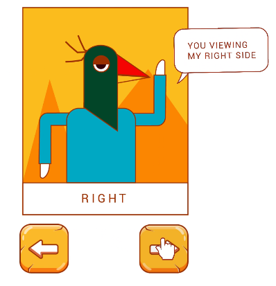
LEFT OR RIGHT?
Round 1
Round 2
In the beginning, the audience will experience the character animation with the eye moving on either side and hair as well. There is a title"LEFT OR RIGHT" at the bottom of the card which indicates what direction the audience prefers to choose. The two buttons are for the audience to choose his or her preferred direction.

When the audience clicks the left button. The graphic change to a left flip character with an eye blink. Text changes when clicking either button which is "LEFT" and "RIGHT". In the second round, I added a text box "YOU VIEWING MY LEFT SIDE" to this interaction which appears when the user clicks either of the buttons. The text box also includes rotate and scale animation. On the other hand, the right button has a similar operation as well.

Inspiration
First, I found inspiration in every design platform. I was looking for a simple interaction animation with aesthetic graphics. And finally, I ended up with these references.

Retrieved from: https://dribbble.com/shots/7174289-INAYA-Festival-identity-details?utm_source=pinterest&utm_campaign=pinterest_shot&utm_content=INAYA+Festival+identity+details&utm_medium=Social_Share
Inspired me the idea of making this kind of graphic into an interactive operation. The hand illustration inspired me the easy interaction for character flipping.
Retrieved from: https://www.freepik.com/premium-vector/set-glass-green-icons-game-interfaces_4938823.htm?epik=dj0yJnU9bmhIWEZuOXc5c2JiLTlyV25UN3NWelhPdVhadVZaN0EmcD0wJm49M2ZCdklkNVVaZ0FPeEZLamNTYjJ6USZ0PUFBQUFBR0RHSDlZ

Retrieved from: https://www.dreamstime.com/stock-illustration-game-buttons-set-cartoon-different-styles-green-stone-wood-vector-interface-assets-image65979373#res26615551
Button Inspiration - I looking for a button have some reflection on it and the bevel visual effect.
Besides, I want to make a button which has some wood texture on it.
Start on Sketches

I try out different styles of graphics and buttons. After that, I export them to adobe illustrator and start designing my character.
Finishing Graphics Style

The finishing chosen graphic style. For the button, I design it in a bevel kind of effect to show the audience that this is clickable. For the font chosen, I choose Roboto font in regular size. I make larger tracking for the text so that it is easy to read and aesthetics purposes as well.
Color Scheme

The color palette for the whole graphic style. I prefer colors that show energetic, vibrant. Besides, I make the graphics all with strokes so that they look more graphic and highlight out some of the primary items.
I just apply animation for eyes and hair movement. For the eye, I animate it with the character's eyeball switches left and right and the hair movement as well. I try to make the animation bring out the meaning of "LEFT OR RIGHT?". After that, I made this animation at the beginning so it looks more interactive compared to the only existing title that tells the audience to choose left or right.
Animations


Pictures for front view animation.
The second animation is flip-side eye blinking. I create the animation so it looks more interactive and interesting.
Pictures for eye blink animation.
I apply this animation when the audience clicks either button, the character turns to the flip side with eye animation.


Cursor
In the second round, I added a cursor and I choose a simple hand-illustrated style that matches the theme.

Flowchart
Round 1 flowchart

Round 2 flowchart

Reflective Evaluation
In the first UI Challenge, I learn the basic interaction which is button interaction. Through this exercise, I learn how to code proper coding for a button interaction and the animation interaction as well. Besides, I also learn a lot from audio coding too. I get to spend time find out the interesting design for this exercise. All in all, the overall process is interesting and fun.


Comments
Post a Comment