Post 6 - Applied Interactive Design
Research & References


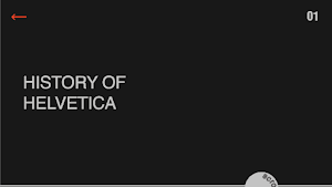
The first page will be a giant Helvetica font drop from the top one by one to form a Helvetica. Arrow button was illustrated in black color in an orange circle.


The Font Anatomy page, which discusses tracking, leading, and curning with animation interaction, will be the next choice page. Moving on to the yellow page, which allows visitors to see Helvetica in various styles such as thin, medium, roman, and so on.

For the brands that use Helvetica, users will first experience a brand's logo show up from the bottom, and users can interact with them by dragging the logo around and drop them in any place.
This idea of this website is a pretty formal website-like interface with primarily scroll interaction and a few buttons to click. The data is nicely structured. This design, however, suffers from a lack of interactivity and the meaning behind this interaction. Then I refine the idea before going on to the second draft.


After clicking the orange button, the visitor will be sent to this website, which provides the options of Helvetica and Playground. When visitors hover over each choice on this page, the backdrop changes to black and the option that they are hovering over changes to white, as inspired by Lin Yew.

When users click into the history option, they will bring to this page for them to interact with the scroller. The interaction for this page is when the number match, it will change to an orange color and the user can click in to view the content.


1960

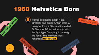
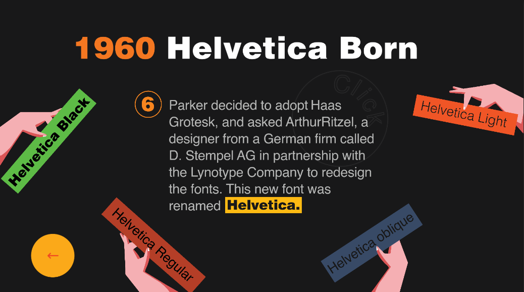
While for the year of 1960, Helvetica Born, users need to click the Helvetica button. 4 hands will emerge, each holding four distinct styles of Helvetica, including Helvetica Black, Helvetica Light, Helvetica Oblique, and Helvetica Light. When users select one of the options, the corresponding style is applied to the body content.

Users will interact with the playground section by dragging the alphabets left or right at certain speeds to align them. Users may click done once they've finished aligning the Helvetica to see how close they got to the perfect alignment.


The hand shown up and choosing the style of Helvetica page got the higher response of interesting in this section as well as the boxing hand page.


People do learn something from the experience.


Most people rate 4 for the overall experience.

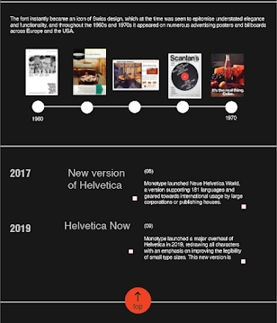
The older version of 1957 Helvetica's Origin required to tap the next button and continue to the next pages same as the other pages in 1957 which was considered UI unfriendly. I then added some small adjustments, such as allowing visitors to directly click the sequence numbers labeled 1,2,3,4 on the right bottom side to proceed to the next page. The yellow button is a button that directs users back to the choose a year page.


I choose the Helvetica font for my project because of its elegant and modern style. It is also a well-known typeface that is used in many areas in this world such as logos, posters, road sign,s and so on. At first, I looked for articles that explained its history. Helvetica font basically separates into 3 sections that are Helvetica Origin in 1957, Helvetica Processing in 1959, and Helvetica Born in 1960.
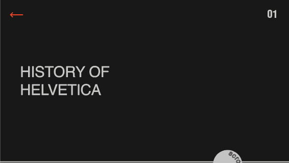
History
1957
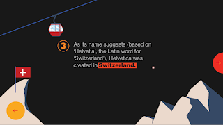
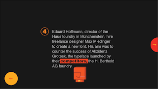
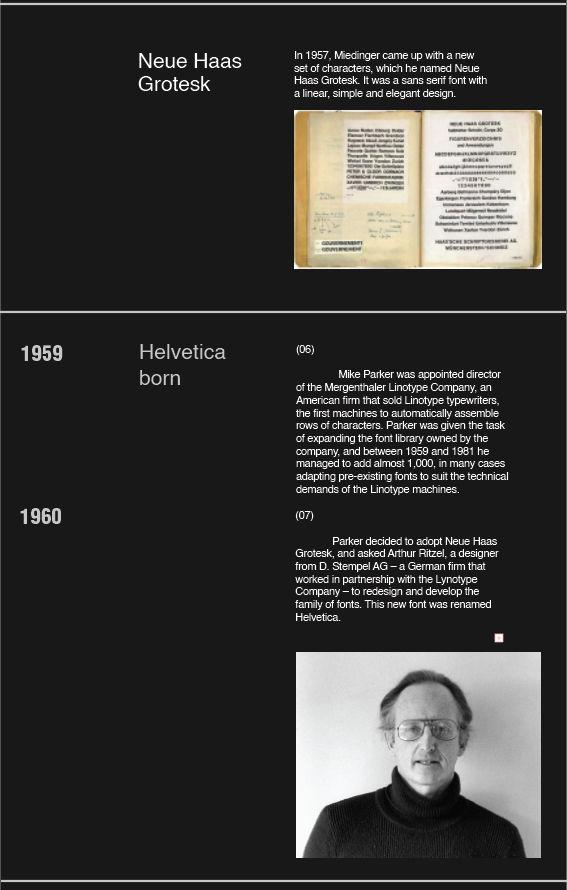
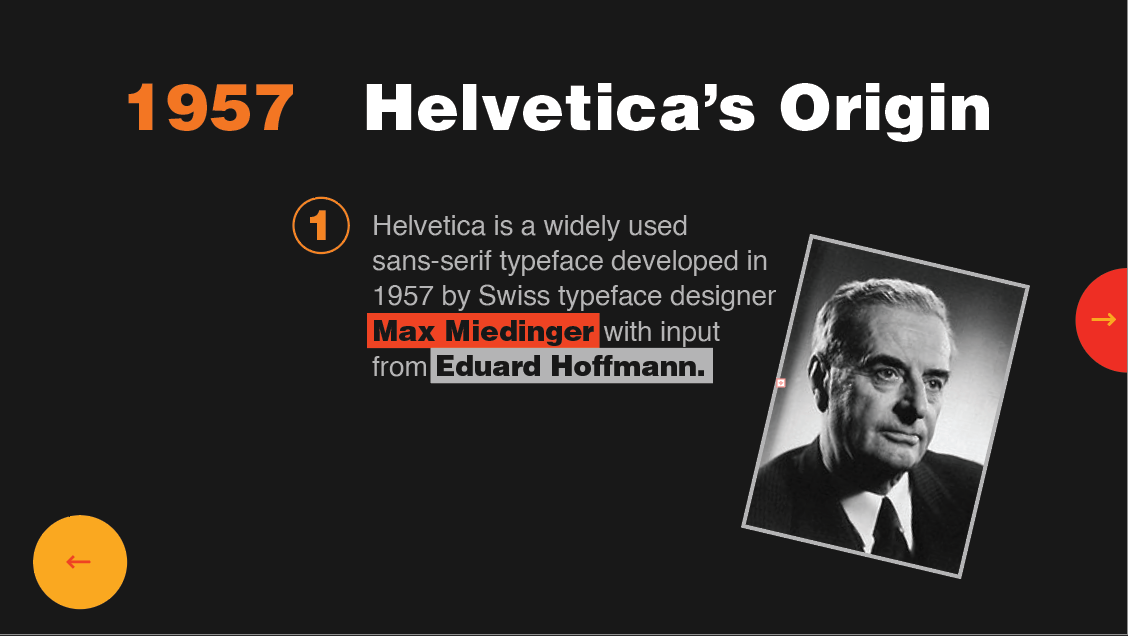
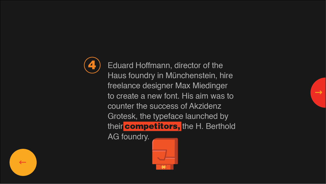
Helvetica is a widely used sans-serif typeface developed in 1957 by Swiss typeface designer Max Miedinger with input from Eduard Hoffmann. It is a neo-grotesque design, one influenced by the famous 19th century (the 1890s) typeface Akzidenz Grotesk and other German and Swiss designs. As its name suggests (based on ‘Helvetia’, the Latin word for ‘Switzerland’), Helvetica was created in Switzerland. Eduard Hoffmann, director of the Haus foundry in Münchenstein, hire freelance designer Max Miedinger to create a new font. His aim was to counter the success of Akzidenz Grotesk, the typeface launched by their competitors, the H. Berthold AG foundry.
1959
Mike Parker was appointed director of the Mergenthaler Linotype Company, an American firm that sold Linotype typewriters. Parker was given the task of expanding the font library owned by the company.
1960
Parker decided to adopt Haas Grotesk and asked ArthurRitzel, a designer from a German firm called D. Stempel AG in partnership with the Linotype Company to redesign the fonts. This new font was renamed Helvetica.
I then gather all this information and applied it to my project.

Helvetica font family
Idea References
Idea references 1: clean layout design with only playing around with the complementary color.
Idea references 2: Layout in a contemporary style, The text in these layouts is organized in a very inventive manner. The color appears to be used as a minor decoration in some layouts to make them stand out.

Idea reference 3: Different colors are utilized to create a more fun-looking layout. In comparison to the first and second ideas, this design is less serious.

Idea reference 4: A collage art design style. This design makes use of photographs to produce a visually appealing layout.
Idea Rationale
Through these idea references and the researches of Helvetica that I have, I manage to go with both the first and third ideas. While the Helvetica typeface is a modern and elegant-looking font, it must have a clean and official appearance. As a result, I expanded on the first concept in my work. At the same time, I decided to use visual design to make the layout seem formal while yet being enjoyable. In addition, I've found that Helvetica font layouts are typically black with a hint of white to create a contemporary aesthetic. As a result, I choose a black theme with some different color decorations in designing them.
Design Process
First Draft


Users will then bring to this page consists of three options to click in which is History, Font Anatomy, and Brands that use Helvetica.


When users choose the history option, they will see a scroll button that instructs them to scroll down. When users scroll down, animations of letters and images will appear. After visitors scroll to the bottom of the page, there is a call to action button that they may click to return to the top without having to utilize the same UI-unfriendly scrolling approach.


This idea of this website is a pretty formal website-like interface with primarily scroll interaction and a few buttons to click. The data is nicely structured. This design, however, suffers from a lack of interactivity and the meaning behind this interaction. Then I refine the idea before going on to the second draft.
Second Draft

The first page remains the same concept and arrangement. Some minor changes take place which are the color choices and the unavailable font that is used to appear at the left bottom page. For the button, the arrows look more UI-friendly in an orange circle.

After clicking the orange button, the visitor will be sent to this website, which provides the options of Helvetica and Playground. When visitors hover over each choice on this page, the backdrop changes to black and the option that they are hovering over changes to white, as inspired by Lin Yew.

When users click into the history option, they will bring to this page for them to interact with the scroller. The interaction for this page is when the number match, it will change to an orange color and the user can click in to view the content.
1957
There are 4 pages in this year which is the origin of Helvetica. Users are required to hover the highlighted text in the body content to view the pictures given. Users can then proceed to the next page by clicking the orange icon.

On the second page, the interaction involves experimenting with physics. When users click the green button, Akzidenz Grotesk appears at the top of the screen, and users may interact with it by moving it.

The third page will be the Switzerland graphic scene and music turns on after users click the Switzerland orange button.
On the year's last page, a boxing hand appears, causing a hit collision impact on the body content.
1959

Moving on to the 1959 year content, Helvetica Processing, this page uses the same concept as the first page from 1957, where users hover over each button in the body text, and a graphic linked to that button appears.

While for the year of 1960, Helvetica Born, users need to click the Helvetica button. 4 hands will emerge, each holding four distinct styles of Helvetica, including Helvetica Black, Helvetica Light, Helvetica Oblique, and Helvetica Light. When users select one of the options, the corresponding style is applied to the body content.
Playground

Users will interact with the playground section by dragging the alphabets left or right at certain speeds to align them. Users may click done once they've finished aligning the Helvetica to see how close they got to the perfect alignment.
The second draft is much better compared to the first draft. I then placed this draft in the unity and starts the coding section.
Cursor

click cursor tells a clear direction that users can click this.

scroll cursor only applied to the specific places which are the choices a year page and Helvetica playground page. This cursor clearly tells users they can drag left and right.

no cursor is only applied to the playground section which is the "H" and "a" of Helvetica that clearly tells users they can't move these two alphabets.

default cursor use for a hover effect and normal state in this project.
Sound Effect
For sound effects, I applied almost every touchable element in different kinds of sound effects.
Graphic References
boxing hand references
Hand references for choosing Helvetica style
typewriter references
Switzerland references
User Testing
I created 8 questions for the user testing and the questions are focused on asking the overall design, their experience when looking at this project, and overall navigation. I will show some important responses as below.
There are 5 responses in this user testing
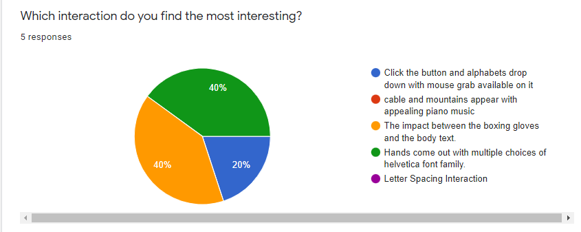
The hand shown up and choosing the style of Helvetica page got the higher response of interesting in this section as well as the boxing hand page.

Most people rate 4 in the overall design.


However, for the navigation, most people remain in general view and I also get suggestions from Lin Yew. Therefore, I make some changes after the user testing.

Most people rate 4 for the overall experience.
Action Plan
After the user testing, I make changes to the navigation and the sound effects.

For sound effects, I change to a more subtle sound and applied only some of the elements like click, drag, and so on.
Final Outcome
6 screenshots


Video Walkthrough
Due to the file size, the video walkthrough for the blog is not explaining anything. My submission folder contains the full explaining video walkthrough.
Self-evaluation
Working on this project has given me a better knowledge of the Helvetica typeface. I like the process of locating information while also learning about the concept of interaction. Even though I have completed around two to three draughts, I like the process and have learned more about interaction and the coding section. I learned to solve the issues I encountered, some with the assistance of Mink. The most enjoyable aspect of this project, in my opinion, will be integrating the technical aspects of the interaction. Besides, I also enjoy the time finding a piece of suitable sound effects for my project. Overall. I think it is a fun yet enjoyable project to working on it.


Comments
Post a Comment